
Memorable insurance for digital natives.
the project
Kaus Insurance has stayed competitive in the insurance industry for more than 30 years by offering low-cost coverage packages from more than 350 products. However, they’ve fallen behind in modernizing their brand and shifting their products from B2B regional agents to an online e-commerce platform.
the problem
Getting insured takes a little foresight and a lot of emotional time and investment. Educating ourselves about what might protect us from events we hope never happen involves a lot of verbiage and sometimes mental backflips, and young people may not be getting insured because they feel it’s more hassle than it’s worth.
the challenge
Over the course of three weeks, I was tasked with conducting user research, creating a brand refresh, and designing a new, responsive site for an insurance giant ready to update and connect with digital natives. Kaus* was eager to reach younger audiences with their affordable insurance packages by providing them online and making the process of getting insured accessible, simple, and easy.
*This is a fictional company.
research
In researching competitive + comparative insurance providers in the US, I noted that Lemonade and Oscar are up-and-coming startups doing amazing work disrupting the insurance industry by providing modern, easy-to-understand products that are mobile app-centric for their tech-savvy user base. I also noted the strengths and weaknesses of other major insurance providers (such as using outdated “get quotes” verbiage everywhere) and created provisional archetypes for each provider.
I wanted to start by asking “How do young people actually view insurance?” I conducted six one-on-one interviews with millennials and other users to hear their experiences and pain points on getting insured.


All of my millennial participants expressed confusion about understanding insurance policies and deciding which ones would be the best fit for their needs.
Some mentioned that modern insurance sites made searching easier, while others felt fatigued by having to “dig around” to find more information on policies. But broadly, they all expressed a range of experience, from general ease of use to confusion or distrust in what they were signing up for.


provisional archetypes
One of my participants stressed this sentiment many times in different ways during her interview.
She valued companies that take care of the communities they serve and treat them with dignity. I created a user persona in response to this admirable trait to humanize Kaus’ future user base.
I also conducted a card sort with common insurance terms as a precursor to making a site map and user flows. The most common categories were home, auto, and life insurance. I used Progressive’s model to further simplify the categories to personal, vehicle, and property to contain the 350+ insurance products that Kaus offers.
sitemaps, task + user flows, and wireframes
After creating the overall structure and navigation patterns, I sketched out three options for the Kaus homepage with each section highlighting CTAs, product features, and initiatives that are important to a successful MVP.
design
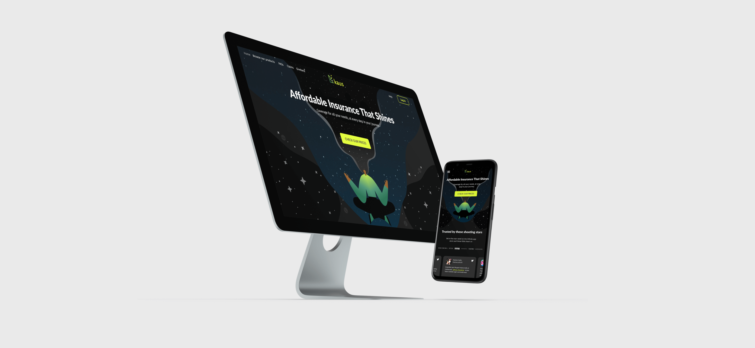
In order to reach a younger customer base and reflect the research’s voice and values, I rebranded their logo and design language to be modern, accessible, and adventurous. Kaus (Arabic for “bow”) is part of the traditional nomenclature for stars within the constellation of Sagittarius. I loved the idea of paying homage to their name by using a starry night sky with pops of color in dark mode on the site.
user testing
In the limited time, I prototyped purchasing a mobile phone plan bundle for user testing and prioritized showcasing the Kaus “Future Forward” giveback program on the homepage based on my research.
Seventy-one percent of the 15 users that tested the site found navigating to purchase one of three mobile plans to be easy and direct. For the second task, I asked users to find a definition for “actual cash value” on the site, and 77% of users were able to navigate to the insurance encyclopedia page without difficulty via ‘FAQ’ or ‘Help’.
feedback and iteration
After analyzing the heat maps of the 15 testers, it seemed that four were confused about which section would have a relevant definition for “actual cash value” on the FAQs page. Would it be in Claims? Or perhaps the policy Q+A section? Both are plausible places to find such a term!
In revising the designs I copy-pasted the insurance encyclopedia description onto the FAQ page, and added descriptions for the other categories to help users to find what they are looking for faster.

revisions affinity map
what I learned
I asked some post-test questions of my users and I was surprised by how many comments I received on the color scheme! Although most users really liked the design and thought it felt adventurous and unique, some users were expecting a lighter background because of their reading preferences, or familiarity with other insurance sites. I personally love dark mode as it’s easier to read and less of a strain on my eyes at night.
If I were to continue to build out this project, I would create a light version, in addition to building out a customer login dashboard and refining the insurance bundle options.

Explore the prototype