

Symptom tracking made simple.

finding my fit
I was never really a watch person until I was gifted a Fitbit Versa two years ago. Now I wear it almost every day. I love seeing how active I’ve been in a day by tracking my activity and workouts.
I use the menstrual tracking feature in the Fitbit app pretty often– it’s so useful to have an accurate record of my health so I can have a productive conversation with my doctor.
the feature
One feature I’ve always wanted is a way to track other symptoms, so I can recognize patterns and gain insights into my health.
I was trying to use some features in the menstrual tracking app to do this, but there just aren’t enough symptoms in the existing list (it’s not customizable). So I thought I would design a tool that would have a similar look and feel but for more generalized health symptoms.
the challenge
My goals with this project were to design a health and symptom tracking feature that would align with Fitbit’s existing app by recycling as many usable elements/functions as possible within a three-week timeframe.


research
I picked the top two wearables with health tracking features, and also a couple of apps that are standalone health trackers or symptom diagnostic tools. Apple Health and Samsung have similar features as Fitbit’s app, but surprisingly Apple’s symptom tracking features were somewhat limited.

The comparative app that had the best features and layout (and that I actually started using for myself) was Bearable.
It’s got great customization when adding symptoms, notes, and pain levels, and it’s mostly easy to use. It even has a notification to ask how you’re feeling each day.
I got some great feedback from a survey I created to find out how people utilize wearables and health apps, and what they might want in a symptom tracking feature. I then created an affinity map and insight statement to synthesize the results.
Most users said they’d value a feature that would be easy to use with trends and data graphs that are easy to understand. They also said that customization and privacy were important.

Feature insight statements are clear, intentional descriptions that turn what’s been discovered through research into an actionable direction for innovation, through the voice of the user. The one I created here helped me to have a solid feel for a user’s situation, frustrations, and future desires for the current Fitbit app.
Results from the card sort below helped me determine that circumstances might be a better category name to use instead of factors, a common term that other apps use to describe events that happened in a day that may or may not contribute to the symptoms the user experienced.

tap the arrows to toggle between personas

tap the arrows to toggle between personas
I created two personas; one for a user that wanted to track a sudden onset of symptoms such as GI and skin issues, and another for a user who wanted to track a mental health issue. Both are two general types of users that could use a tool like this to make sense of what’s going on with their health.
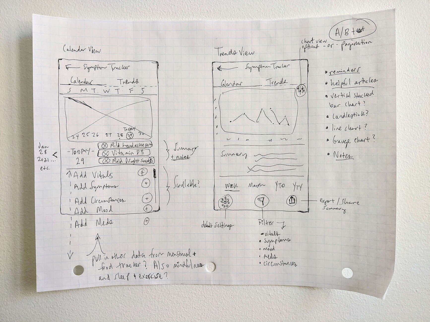
sketches + styling
I repurposed the existing Fitbit menstrual tracking calendar and trends sections for this tool because it already has some of the same categories and functionalities that would be useful. I pulled in charts and data visuals from the Fitbit exercise and sleep tracking pages, and I reused the meters in the food tracking feature to indicate pain and mood levels.
design
The foundations of this feature are tracking and trends– the calendar tab is the space to add symptoms for the current or previous days and see a summary of the details recorded. The trends tab helps users understand how their symptoms and circumstances might be connected.
Based on my research it was important to include an easy-to-read summary of symptoms and trends for users who might find it difficult or intimidating to read graphs. I also included cards for helpful related health articles so users might feel empowered to take action on their symptoms.
user testing
After prototyping, I tested adding details to the symptom tracker, viewing symptom details and trends, changing the timeframe of trends data, and finding health articles with users. I also asked a few questions after the tasks were complete to get more general impressions and feedback.
The first round of results showed a lot of users were unsure of where to change the dates for viewing their trends data, even though most of them responded that they would look in the “Change dates” option first to find it.
Five of the nine testers browsed through the chart visuals first, before tapping on the “change dates” dialogue.
feedback and iteration (v1)
In my iterations, I adjusted the wording of “change dates” to “change trends dates” and added an indicator arrow. I also made the “This Week” bolded title clickable and linked it to the date change overlay, since a lot of users attempted to click it.
I also added the specific date ranges for the data on each chart view for clarification.
feedback and iteration (v2)
The second round of testing resulted in a 50/50 split; half of the users had direct success while others still gravitated to the “calendar” tab to change the trends dates first, before finding the link. This indicated to me that the label was still confusing, so I changed the tab title to “tracking”.
If I were to test again I would also build the “option” menu and add “change trends dates” redundantly there, since a few users tried to tap that button.
what I learned
This was a unique challenge. It was tricky to figure out how to organize categories (I could have easily included more!) and create customization because there are hundreds of possible symptoms to track.
I wanted to make sure a user could add exactly what they wanted to track instead of providing a preset list, so I made that the priority in each dropdown. If I were to build out this feature further I would have designed the customization pages as well as a way to type in notes for symptoms and a way to show them in the calendar and trends views.
But more than anything I really hope that Fitbit will create a symptom tracking feature in their app in the future!

Play with the prototype