

A companion for adventures in architecture.
the project
I am a huge fan of a design + architecture festival that takes place every October in New York City, called Open House New York. This citywide adventure offers mostly free tours of unique places that are open to the public during the festival weekend.

the festival
The biggest draw of the festival is that there’s a ton of variety in the type of participating sites, and that it’s really exciting to make a plan and explore.
the problem
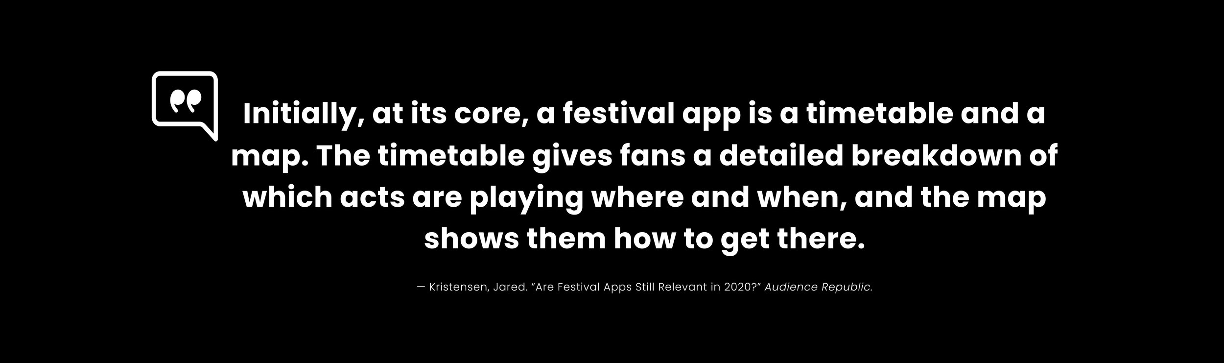
Although it’s fun to anticipate new sites, reserve spots, and plan my weekend every year, it’s also a time-consuming and somewhat frustrating process. The tools that OHNY offers on their site for browsing and creating itineraries are limited and since creating and sharing a plan isn’t as straightforward as it could be, I decided to design an end-to-end app for the OHNY weekend.
the challenge
The goals I pursued within a three-week timeline were to create a mobile app for the festival that would make browsing and creating itineraries for the weekend easy and enjoyable for explorers.
research
I scheduled a one-on-one interview with a friend who’s visited sites with me over the years. I was curious what they’d have to say and how their thoughts would diverge from the ideas that I had for an app.
My friend lamented that it takes a lot of time and effort to figure out what sites are worth seeing, and planning to get from one site to another. Often they would need to bookmark sites on the OHNY website, print out their itinerary, and use other map apps to create a plan for the weekend — keeping track of everything and sharing it with others was more involved than it should have been.
They especially wanted a way to see all the sites in context and relationship to each other in a map view since getting from point A to point B was always an undertaking.
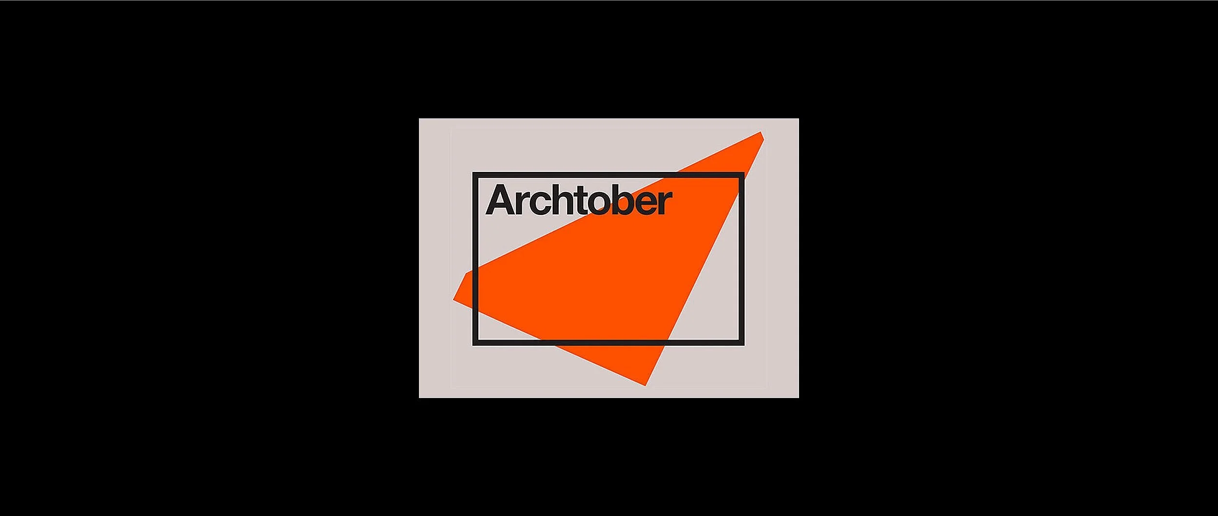
One competitive festival model is Archtober, a celebration of architecture and design, also in New York City.
Archtober is organized by the Center for Architecture and takes place over the entire month of October, while OHNY is just one weekend in October (OHNY is a partner of Archtober). Neither festival has a mobile app.
Visit a City, Atlas Obscura, and Tripadvisor are comparative sites I explored in secondary research because they involve city exploration and travel planning.
I created a user journey map in addition to a persona, based on my friend’s insights. I felt the user journey map would be a fascinating way to showcase these needs, wants, and pains because there are real-world sites and travel involved, the weekend is literally a journey. I also wanted to consider my own needs and wants as a user — to better organize sites into categories for faster and easier browsing.

sitemaps, sketches + wireflows
I then created a sitemap for the way their website is organized currently, and then a second that would work better for an app by condensing the site pages into the browsing categories.

I sketched wireframes for the app’s itinerary, the home page, and the site’s profile on paper. This helped me to quickly get the ideas I had for organizing a lot of possible categories out of my head. I wanted to make sure this app utilized thumb zones well and planned to have a bottom-based nav bar and as many of the most important options available, such as sharing and adding sites and friends to an itinerary.
I also made an interactive user flow with Overflow that has login screens and options for signing up for a profile. From a business standpoint I thought it may be best to let new users browse in the app first to show off its value, and only requiring a sign up if they wanted to create an itinerary with the provided tools.

styling
I wanted to make this app look as realistic as possible, using existing OHNY branding and styles. I added gradients and a secondary font.
design
One big need aside from a robust map feature was to have a more streamlined way of browsing through hundreds of sites and activities. I designed the homepage as the starting point, giving “reservations required” sites the priority since these sites get booked just minutes after they go live.
The rest I grouped based on users’ needs for the weekend, such as searching by day, time, or some of OHNY’s curated categories. I also added a way to browse by tags to “build your own adventure”.
In addition to organizing the sites by category upfront, I designed a map page where users who are location-driven can plan and browse sites easier.
The new itinerary design includes directions, travel time estimates with a Citymapper or Mapbox API, route customization based on the time/reservation details of each site, and inviting friends to your plans.
user testing
I then tested the functionality of browsing sites, adding a site to an itinerary, and then adding or removing friends to that itinerary with users. I also wanted to get feedback on the map features and design.
feedback and iteration
One user thought I should consider swapping out the profile for a map button in the bottom nav bar for easier access and add search there as well.
They also thought that a “discovery” button on the map might be useful to add spontaneity to exploring on the weekend of the festival, where users could see open sites nearby while they are out and about.
My users said they preferred the dark mode version, but thought it would be good to have both since most phones now allow users to set app color based on their phone’s default settings or sunrise/sunset.
I also prototyped a way to swipe left to delete a site from the itinerary in my iterations.

what I learned
This project helped me explore how API’s are implemented, and I chose mapbox and citymapper as the main options in this app in considering OHNY’s needs (mapbox is free / cheaper to use than google).
I also learned that redundancies in options for searching and filtering can be helpful. I was able to play with the prototype on my phone using Figma mirror, but I wish that I had the ability to conduct user tests in person instead of virtually with Zoom, since that would have given me even more practical feedback on my design’s functionality.

Play with the prototype